Bigger and Biggest
Assets are @2x
Assets are @3x
iPhone 5(s) 320 by 568 points
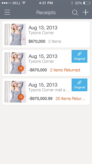
iPhone 6 375 by 667 points
iPhone 6+ 414 by 736 points
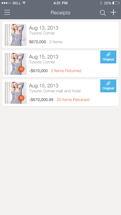
Don't Scale! Adjust. Take advantage of the extra points we are given by fitting in extra content and white space.
iPhone 5(s) 320 by 568 points
iPhone 6 375 by 667 points
iPhone 6+ 414 by 736 points
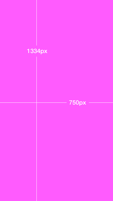
Design Process / Documents. Start designs at: 1334px by 750px
iPhone 6 -> iPhone 5 and below
- When designing keep in mind where you are going to lose 55pts (110px). Figure out which elements will have a flexible width.
iPhone 6 -> iPhone 6+
- You can use those flexible width's to fill the extra 39 points.
- Preview iPhone6+ by duplicating your document and adjusting the canvas to 828px by 1472 (iphone 6+ if it were @2x) I dont think its worth working in @3x. Files sizes will be too bloated and slow.
- Consider editing font size, layout, etc.
- Make sure all assets you cut are @3x. (use vector assets or design assets in a linked photoshop doc @3x)